
Intro
Project
Saasgenie - ITSM & CX Website Revamp
Role
UI/UX Designer
Platform
Webflow
Year
2025
From a cluttered, low-trust presence to a conversion-focused, editorially bold digital experience.
Results
Impact
at a Glance
Spike on Sep 23, 2024: The week of launch, a single day peaked at 27 new users — marking the clearest signal that the redesign drove immediate organic interest. The US market surged to 144 active users on May 20, 2026 — 3.8× above expected. Growth driven by Chrome + Organic Search users.
Engagement rate across all sessions 12,009 engaged sessions
40%
Organic search new users
SEO lift post-revamp
5.4K
Sessions recorded post-launch
Avg. 1.71 pages / session
29K+
01 - The Brief
A product with enterprise ambition, held back by its own website
SaasGenie helps organizations choose, implement, and optimize ITSM and CX platforms — faster than anyone else. But their website told a completely different story. Visitors landed, couldn't orient themselves, and left. No clear value proposition. No trust signals. No obvious next step. The design brief was simple: fix that — completely.
02 - Process
How We Designed Saasgenie
Four deliberate phases — each building on the last — to move from vague intentions to a system that performs in the real world.
4 Core Challenge - Human-Centered Design.

Discovery:
Audit & research
Reviewed existing analytics, mapped user flow drop-offs, identified exit pages, and benchmarked against top ITSM players. Defined what "winning" looked like in measurable terms.

Architecture:
Information structure
Restructured navigation around how B2B buyers actually shop:
Services → Solutions → Accelerators → Resources. Every page has one job.

Identity:
Visual language system
Built a dark editorial palette: near-black grounds, warm off-white type, and a signature orange-red for CTAs. Paired Cormorant's serif expressiveness with DM Sans' utilitarian clarity.

Execution:
Build & optimize
Implemented in Webflow with performance-first decisions. Every section reviewed against the conversion goal. GA4 tracking wired from day one to measure what matters.
02 - The Problem
A site that didn't reflect the
product's ambition
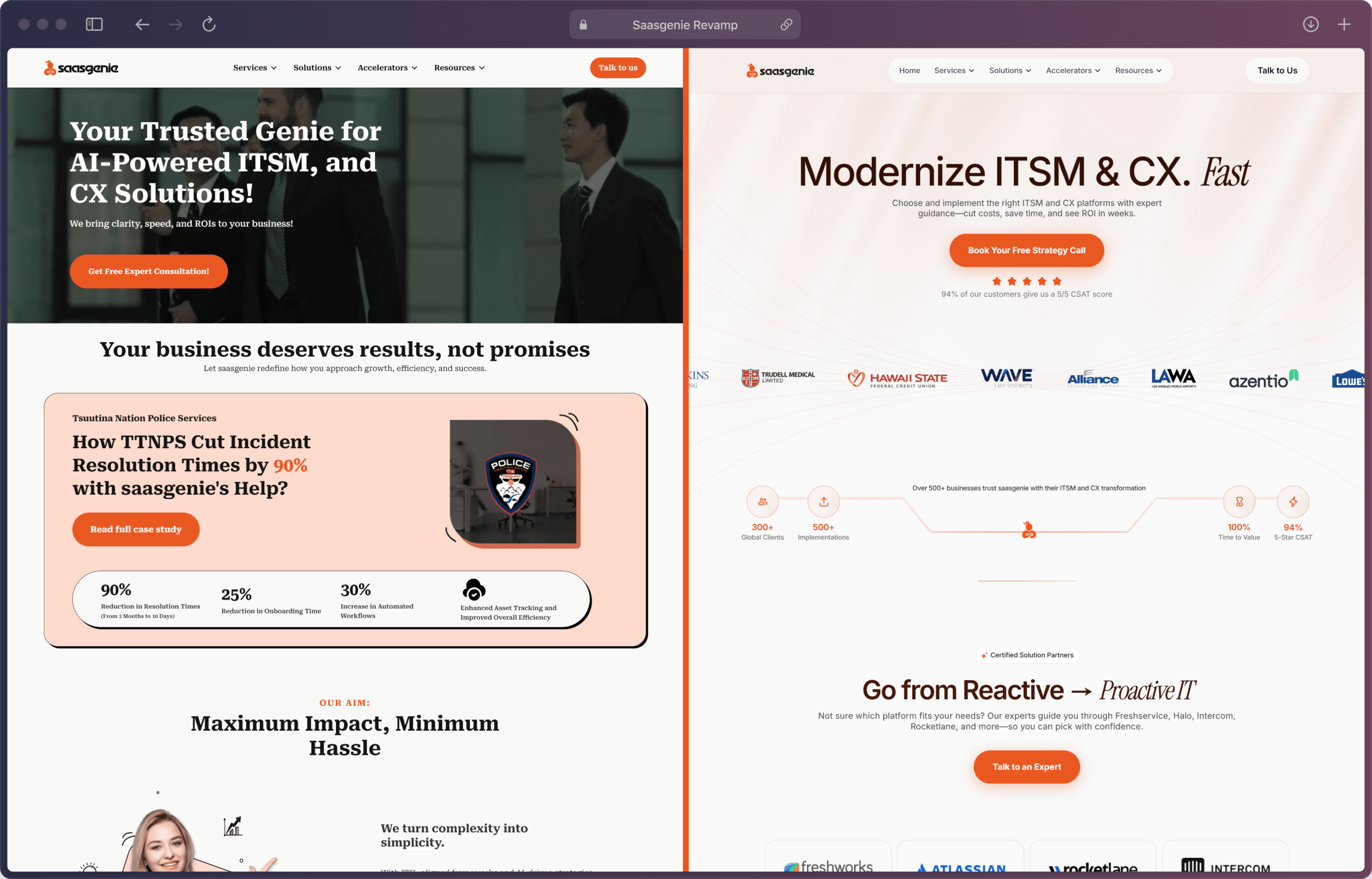
SaasGenie's existing website struggled to communicate value clearly. Visitors landed, couldn't orient themselves, and left — with no clear path to booking a strategy call or understanding the ITSM + CX offering.
Before
Redesign
No clear value proposition above the fold
Generic layout — nothing unique to ITSM/CX
Weak social proof — no logos, no ratings
CTA buried below multiple scroll sections
Low trust signals for B2B decision-makers
No visual hierarchy guiding the eye
After
Redesign
"Modernize ITSM & CX. Fast." — instant clarity
Bold editorial hero with orange accent system
Client logos (Hawaii State, Wave, LAWA, Azentio…)
5-star rating + "84% of our clients…" stat above fold
Single CTA: Book Your Free Strategy Call
Cinematic laptop mockup — premium perception

02 - The Text Styles
Text Styles
Manrope
Manrope is a modern, geometric sans-serif that works across both headings and body copy. Its clean construction and optical balance make it equally effective at 72px display headlines and 14px interface labels. Sharp without being cold, it carries the professional tone of a B2B product while remaining approachable. Used for all headings, subheadings, body copy, labels, eyebrows, and UI text throughout the page.
Instrument Serif
Instrument Serif is an elegant, high-contrast editorial serif used exclusively for moments that need to breathe — large display headlines, italic emphasis phrases, pull quotes, and the dramatic stat callouts. Where Manrope builds trust, Instrument Serif builds tension. The two together create the contrast that gives the page its editorial character.
TYPOGRAPHY
ABCDEFGHIJKLMNOPQRSTUVWXYZ
abcdefghijklmnopqrstuvwxyz
1234567890
Aa
Regular
Aa
Medium
Aa
Semi-Bold
Aa
Bold
Instrument Serif
ABCDEFGHIJKLMNOPQRSTUVWXYZ
abcdefghijklmnopqrstuvwxyz
1234567890
Aa
Italics

02 - The Color Styles

Landing Page

Solutions Page - ITSM

Solutions Page - Freshworks

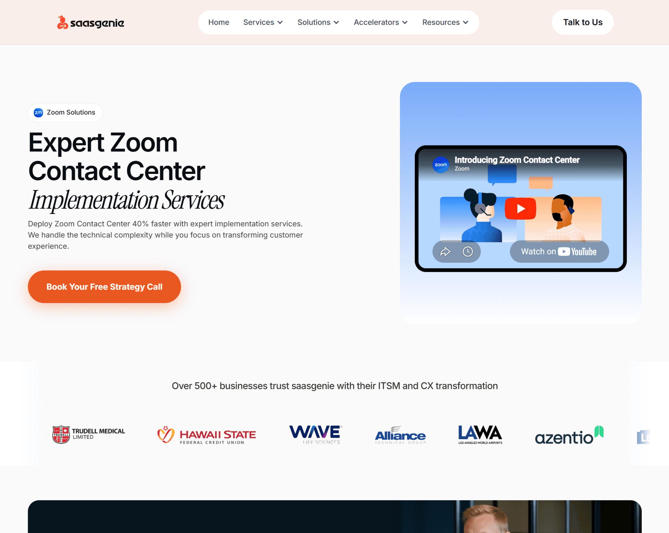
Solutions Page - Zoom
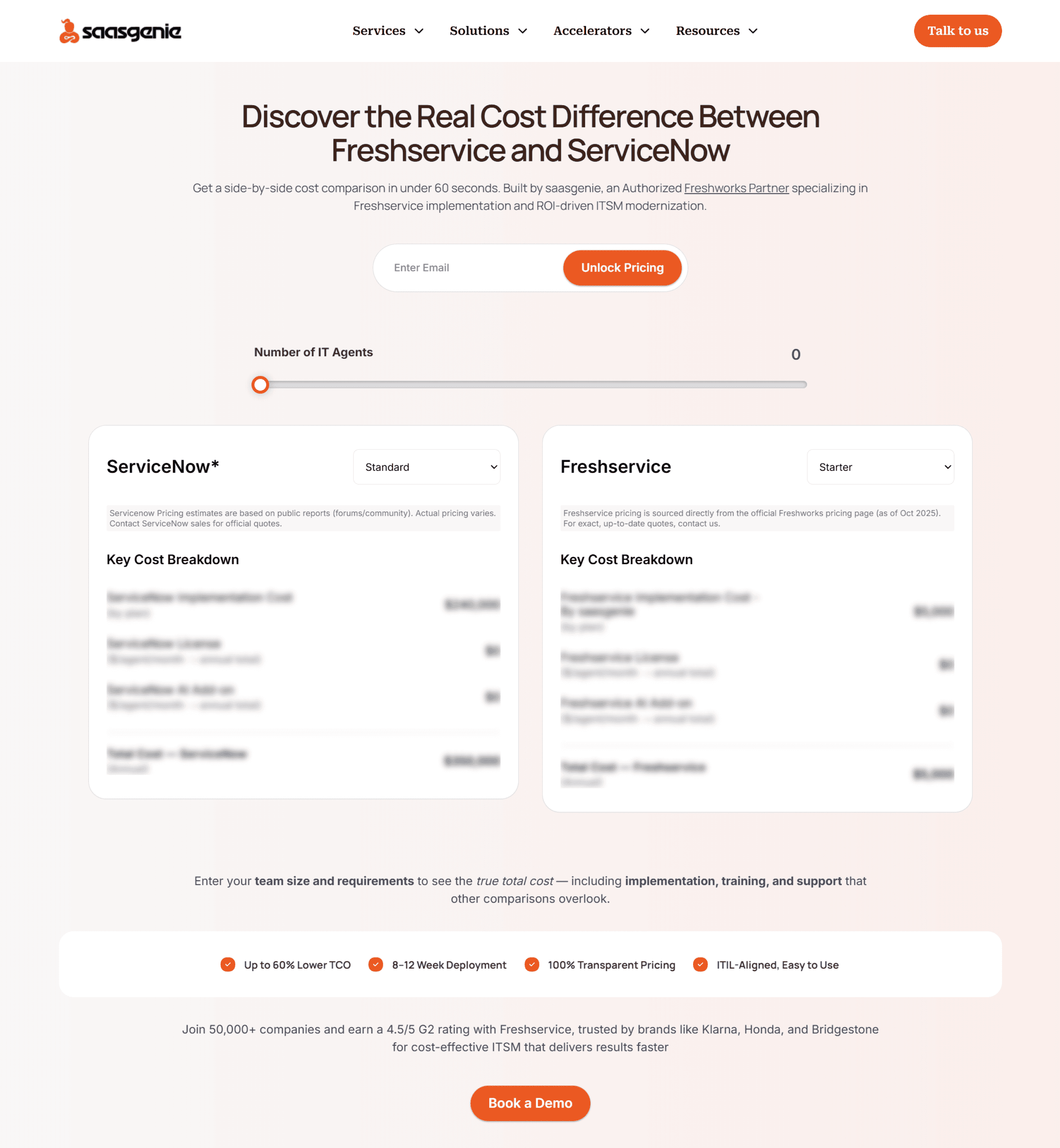
Advanced ROI Calculator - Design - Dev
Contact Us Page

Solutions Page - PSA


Solutions Page - CX


